
Vyane
websitescopeIn development · Strategy · Naming +4
Design and technology from a single source.
I’m Denis. MOQRO is my studio in Kriens near Lucerne.
I only take on a few projects at a time, so each one gets my full attention. You talk to me from start to finish: I design and build your project myself.
Small. Independent. Direct.
All we had was an idea, not a single bottle. A few weeks later we had a name, a story and a page we could show people. That was exactly what was missing.
Debt collection sounds like pressure. MOQRO turned it into a process even debtors understand. Anyone who sees the prototype stops asking what it is meant to be.
Menu, labels, the sign above the door: it all looks as if it had always been this way. Guests ask who made it.
Maybe you need a new logo. Maybe a whole website. Together we’ll work out what makes sense for your plans. If you’d like to talk about a project, write to me.
Just starting out, or does your brand no longer feel like you? Together we look at what makes you who you are. From that comes a name, a logo and a design you feel at home with. Plus images of your product before it’s even produced.
Your website should show what you do and help people find their way around. I take care of structure, design and build. Platforms, marketplaces and web apps we think through first, then I build a first version you can try out.
All prices are starting prices in Swiss francs. They cover a project that is thought through rather than rushed. After our first conversation you get a fixed-price quote: no surprises, no timesheets afterwards.
As of 2026 · excl. VAT
A logo for a sole proprietorship and one for a brand with eight product lines are not the same thing. The figures show where things start. After the first conversation, the price is fixed.
One third when the order is placed, one third after design approval, the rest on handover. For smaller projects under 3’500, two instalments. Payment term 20 days.
Licences for typefaces and images, hosting and domain costs, and printing. These go directly through you, so you keep the rights.
If you like, I’ll stay on board — for maintenance, further development and new content. On demand at the hourly rate or with a monthly allowance.
All prices in CHF, excluding VAT. The terms and conditions apply.
I’m Denis Mihaljevic. MOQRO is my studio in Kriens near Lucerne. I only take on a few projects at a time, so each one gets the attention it needs.
You talk to me, and I’m also the one doing the work. Nothing gets handed from department to department, and nothing gets lost along the way.
I’m a designer and a developer at the same time. So I don’t just show you ideas as pictures, but as something you can click and try out.
Vyane, Beedaro, Mendi and Octocade are my own projects. With them I try out what I recommend to you: brands, business models and processes under real conditions.
From Kriens, I work with companies and founders all over Switzerland. In person, by video or a mix of both, whatever suits you.
In our first conversation we look at where you stand, what you want and who it’s for. Afterwards you know whether I’m the right fit and what the project involves.
I look at your market and show you first directions. We decide together, for good reasons, not just on taste.
The chosen direction becomes your brand, website or application. I build the most important parts early, so we can see whether it works in everyday use.
I build everything, test the important paths and hand over your files, website and a short guide.
MOQRO is deliberately staying small. For individual projects I work with freelance specialists, and right now I’m looking for these people.
You set brands in motion: logo animations, motion in interfaces and short product films. You know After Effects or Rive well, and Lottie is no stranger to you.
You build interfaces with React, Next.js or Astro that are fast, accessible and precise, right down to the last animation.
You’re studying communication design or have just graduated, and want to work on brands, websites and visual worlds, from the first draft to handover.
Photography, 3D, writing or something I haven’t thought of yet: show me what you do.
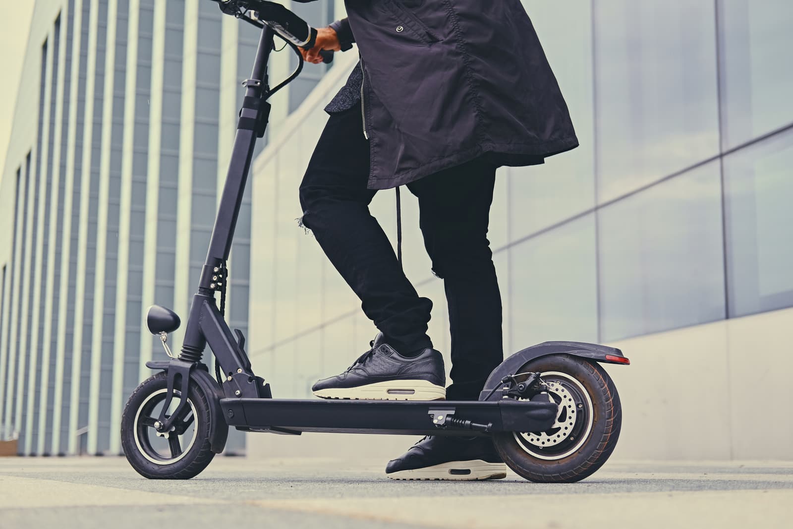
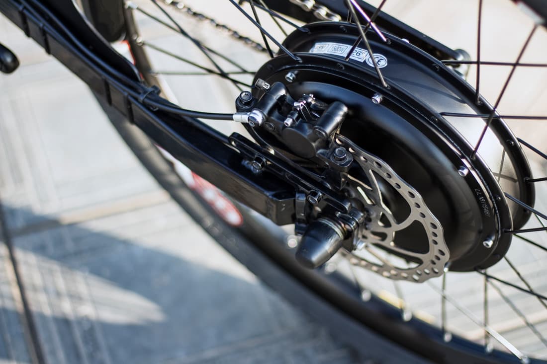
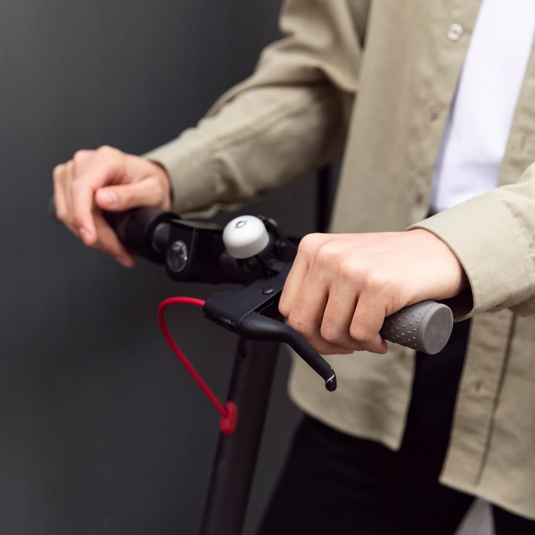
Ralvix builds lightweight e-bikes for the city. The brand needed to look like speed without getting loud.
The mark is an R tipping forwards, with the dot below standing for the wheel. The geometric sans serif carries the precision of the engineering, and the tight colour palette lets product images speak for themselves.
Clear space. Around the logo there is a free space of a quarter of its height. No text, images or edges reach into this zone.
Minimum size. 24 px high on screen, 8 mm in print.
Not allowed. The logo is never distorted, rotated or set in other colours.
Heading · Manrope ExtraBold
ABCDEFGHIJKLMNOPQRSTUVWXYZ
abcdefghijklmnopqrstuvwxyz
0123456789 & ! ? «»
Ride and clear your head.
Heading · 64 / 64
E-mobility
Subheading · 29 / 35
The mark is an R tipping forwards, with the dot below standing for the wheel. The geometric sans serif carries the precision of the engineering, and the tight colour palette lets product images speak for themselves.
Body · 16 / 24 · Manrope Regular
Ride and clear your head.
‘Ride and clear your head.’
The line sums up what Ralvix stands for. It accompanies the logo on campaigns, packaging and online, but never within the logo’s own clear space.

Cargoarcher organises air freight for spare parts that have to be there tomorrow. The brief was a brand with attitude and reliability.
Wings and an arrowhead form a badge like the ones pilots wear. The star in the centre marks the destination. Heavy capitals give the brand weight on freight papers, containers and uniforms.
Clear space. Around the logo there is a free space of a quarter of its height. No text, images or edges reach into this zone.
Minimum size. 24 px high on screen, 8 mm in print.
Not allowed. The logo is never distorted, rotated or set in other colours.
Heading · Manrope ExtraBold
ABCDEFGHIJKLMNOPQRSTUVWXYZ
abcdefghijklmnopqrstuvwxyz
0123456789 & ! ? «»
Delivered right on target.
Heading · 64 / 64
Air freight
Subheading · 29 / 35
Wings and an arrowhead form a badge like the ones pilots wear. The star in the centre marks the destination. Heavy capitals give the brand weight on freight papers, containers and uniforms.
Body · 16 / 24 · Manrope Medium


Delivered right on target.
‘Delivered right on target.’
The line sums up what Cargoarcher stands for. It accompanies the logo on campaigns, packaging and online, but never within the logo’s own clear space.
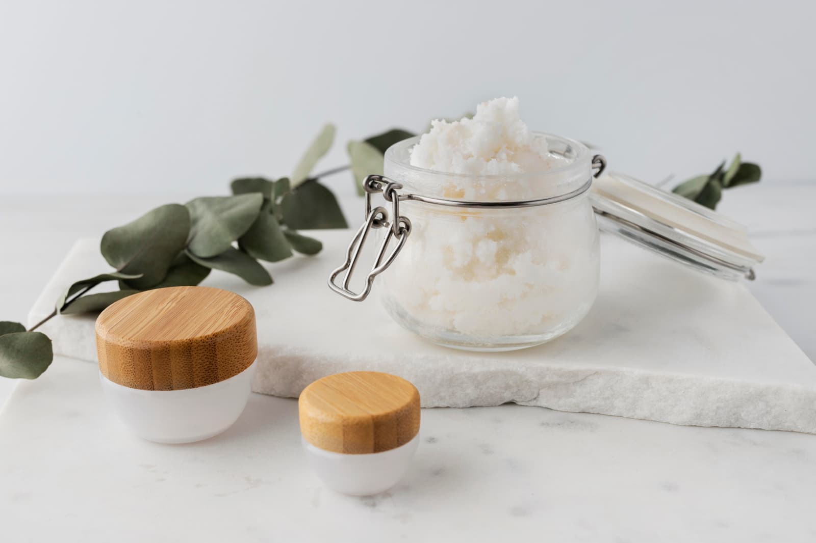
Ceyra makes skincare from plant seeds. The brand needed to feel calm, sensual and honest.
A seed opens into a bud, and beneath it the lettering sweeps out in a single line. The fine serif and plenty of white space give the products room. The colours come from clay, skin and dried greens.
Clear space. Around the logo there is a free space of a quarter of its height. No text, images or edges reach into this zone.
Minimum size. 24 px high on screen, 8 mm in print.
Not allowed. The logo is never distorted, rotated or set in other colours.
Heading · Georgia
ABCDEFGHIJKLMNOPQRSTUVWXYZ
abcdefghijklmnopqrstuvwxyz
0123456789 & ! ? «»
Care that grows.
Heading · 64 / 64
Natural cosmetics
Subheading · 29 / 35
A seed opens into a bud, and beneath it the lettering sweeps out in a single line. The fine serif and plenty of white space give the products room. The colours come from clay, skin and dried greens.
Body · 16 / 24 · Manrope Regular
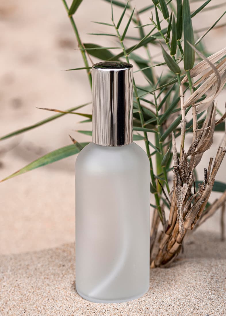
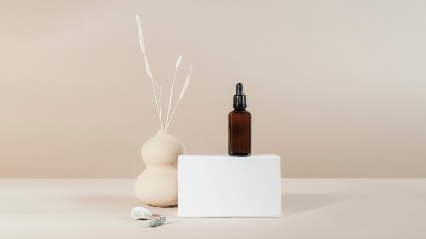
Care that grows.
‘Care that grows.’
The line sums up what Ceyra stands for. It accompanies the logo on campaigns, packaging and online, but never within the logo’s own clear space.
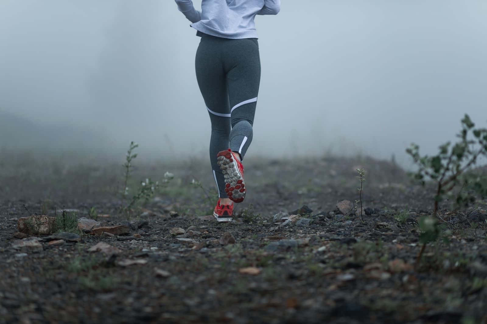
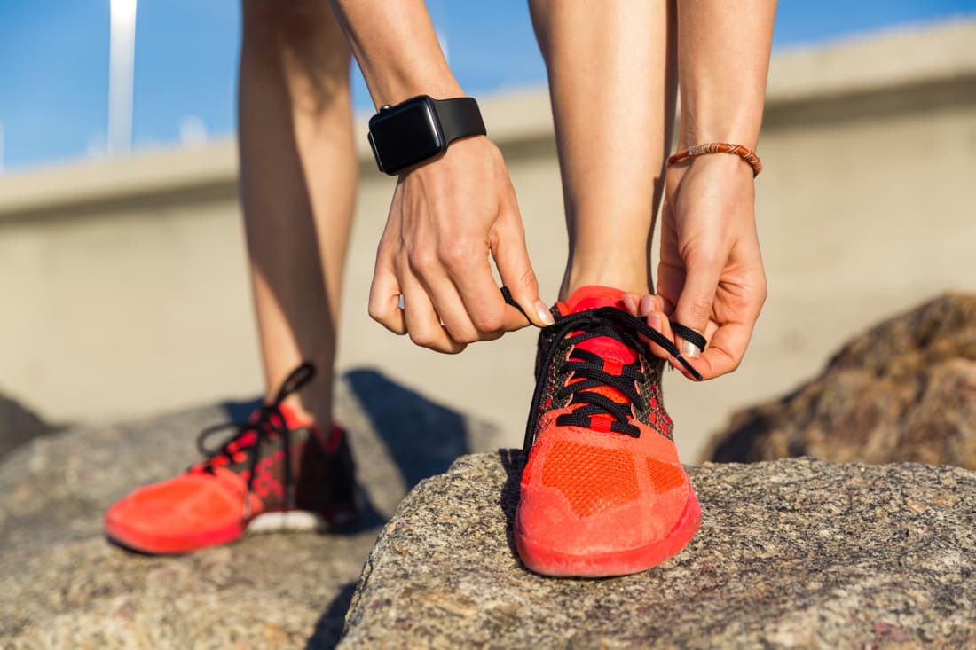
Zpringa develops running shoes for trail and road. The brand needed to show energy and still hold its own on a shoe.
A hare in full leap, stretched out like a running stride. The lettering is custom drawn, with letters that push forwards. Strong signal colours work on the sole, the box and the race bib.
Clear space. Around the logo there is a free space of a quarter of its height. No text, images or edges reach into this zone.
Minimum size. 24 px high on screen, 8 mm in print.
Not allowed. The logo is never distorted, rotated or set in other colours.
Heading · Manrope ExtraBold
ABCDEFGHIJKLMNOPQRSTUVWXYZ
abcdefghijklmnopqrstuvwxyz
0123456789 & ! ? «»
Light as the first kilometre.
Heading · 64 / 64
Running shoes
Subheading · 29 / 35
A hare in full leap, stretched out like a running stride. The lettering is custom drawn, with letters that push forwards. Strong signal colours work on the sole, the box and the race bib.
Body · 16 / 24 · Manrope Medium
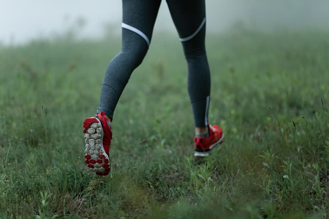
Light as the first kilometre.
‘Light as the first kilometre.’
The line sums up what Zpringa stands for. It accompanies the logo on campaigns, packaging and online, but never within the logo’s own clear space.

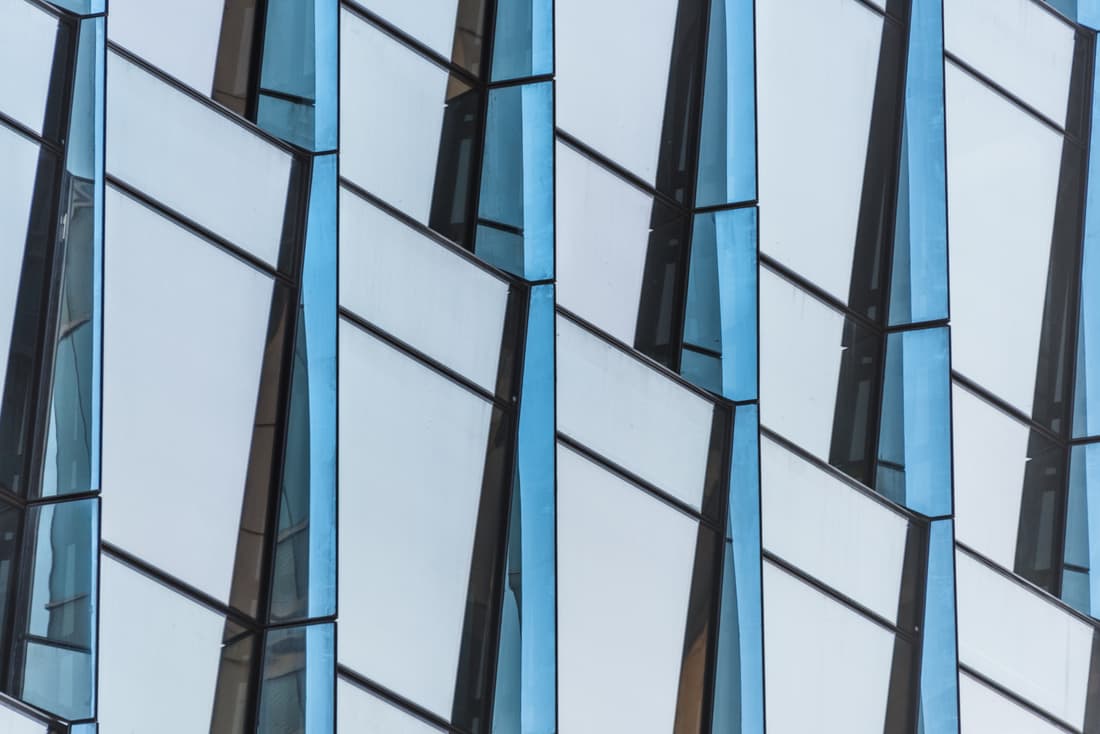
Reflecta plans and installs glass facades for residential and office buildings. The brief was a brand as clear as the material.
The R is made of staggered stripes, like light refracting in glass. The compact sans serif fits on site boards and plans. The palette stays cool, with a light blue as the reflection.
Clear space. Around the logo there is a free space of a quarter of its height. No text, images or edges reach into this zone.
Minimum size. 24 px high on screen, 8 mm in print.
Not allowed. The logo is never distorted, rotated or set in other colours.
Heading · Manrope Bold
ABCDEFGHIJKLMNOPQRSTUVWXYZ
abcdefghijklmnopqrstuvwxyz
0123456789 & ! ? «»
We build with light.
Heading · 64 / 64
Glass and facade construction
Subheading · 29 / 35
The R is made of staggered stripes, like light refracting in glass. The compact sans serif fits on site boards and plans. The palette stays cool, with a light blue as the reflection.
Body · 16 / 24 · Manrope Regular

We build with light.
‘We build with light.’
The line sums up what Reflecta stands for. It accompanies the logo on campaigns, packaging and online, but never within the logo’s own clear space.

Nuvexa is an app that brings together readings from doctor’s visits and everyday life. The brand needed to build trust without feeling clinical.
Four circles grow together into a cloverleaf: four data sources, one picture. The shape works as an app icon just as well as on letterhead. Soft colours and a wide sans serif keep the brand friendly.
Clear space. Around the logo there is a free space of a quarter of its height. No text, images or edges reach into this zone.
Minimum size. 24 px high on screen, 8 mm in print.
Not allowed. The logo is never distorted, rotated or set in other colours.
Heading · Manrope ExtraBold
ABCDEFGHIJKLMNOPQRSTUVWXYZ
abcdefghijklmnopqrstuvwxyz
0123456789 & ! ? «»
Health that thinks ahead.
Heading · 64 / 64
Digital health
Subheading · 29 / 35
Four circles grow together into a cloverleaf: four data sources, one picture. The shape works as an app icon just as well as on letterhead. Soft colours and a wide sans serif keep the brand friendly.
Body · 16 / 24 · Manrope Regular

Health that thinks ahead.
‘Health that thinks ahead.’
The line sums up what Nuvexa stands for. It accompanies the logo on campaigns, packaging and online, but never within the logo’s own clear space.
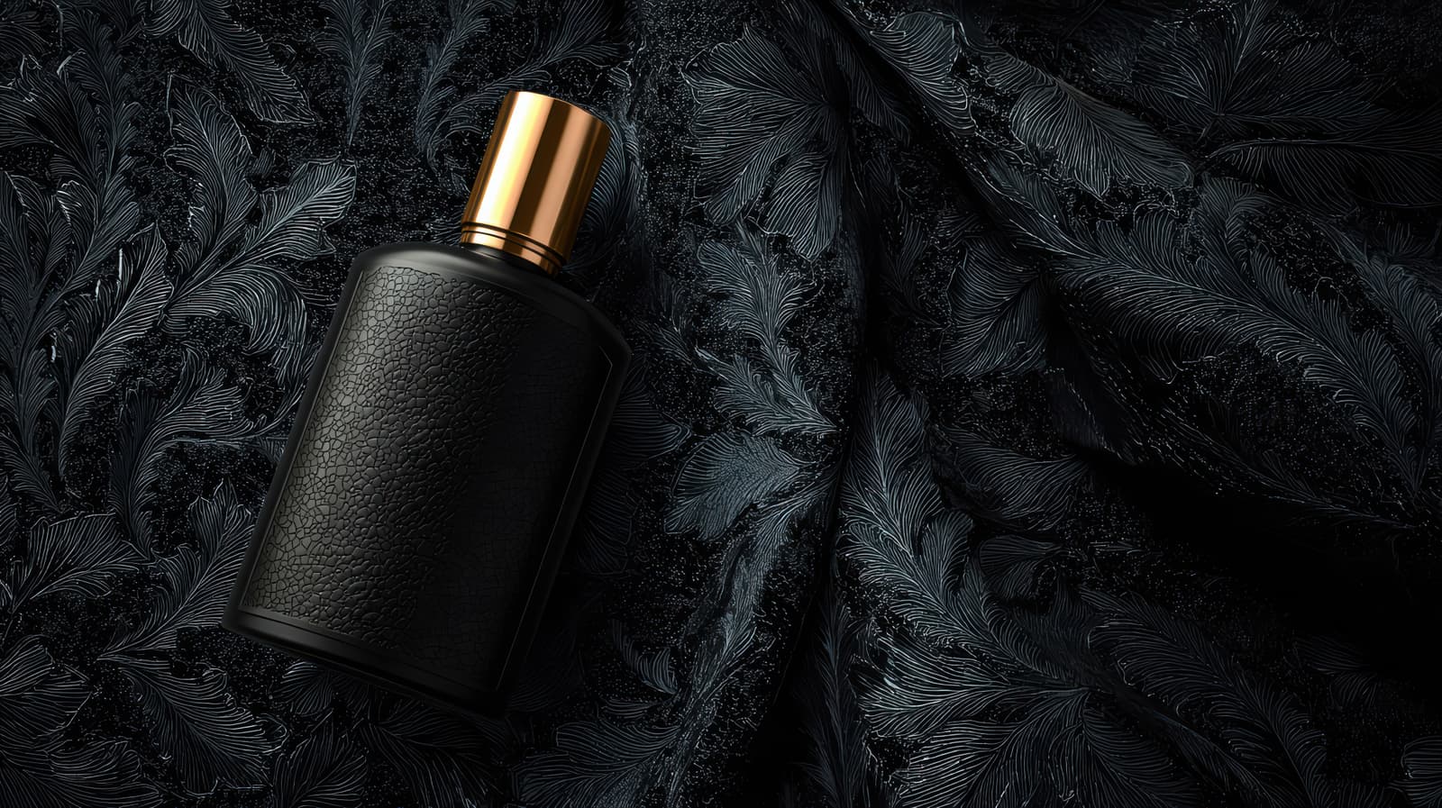
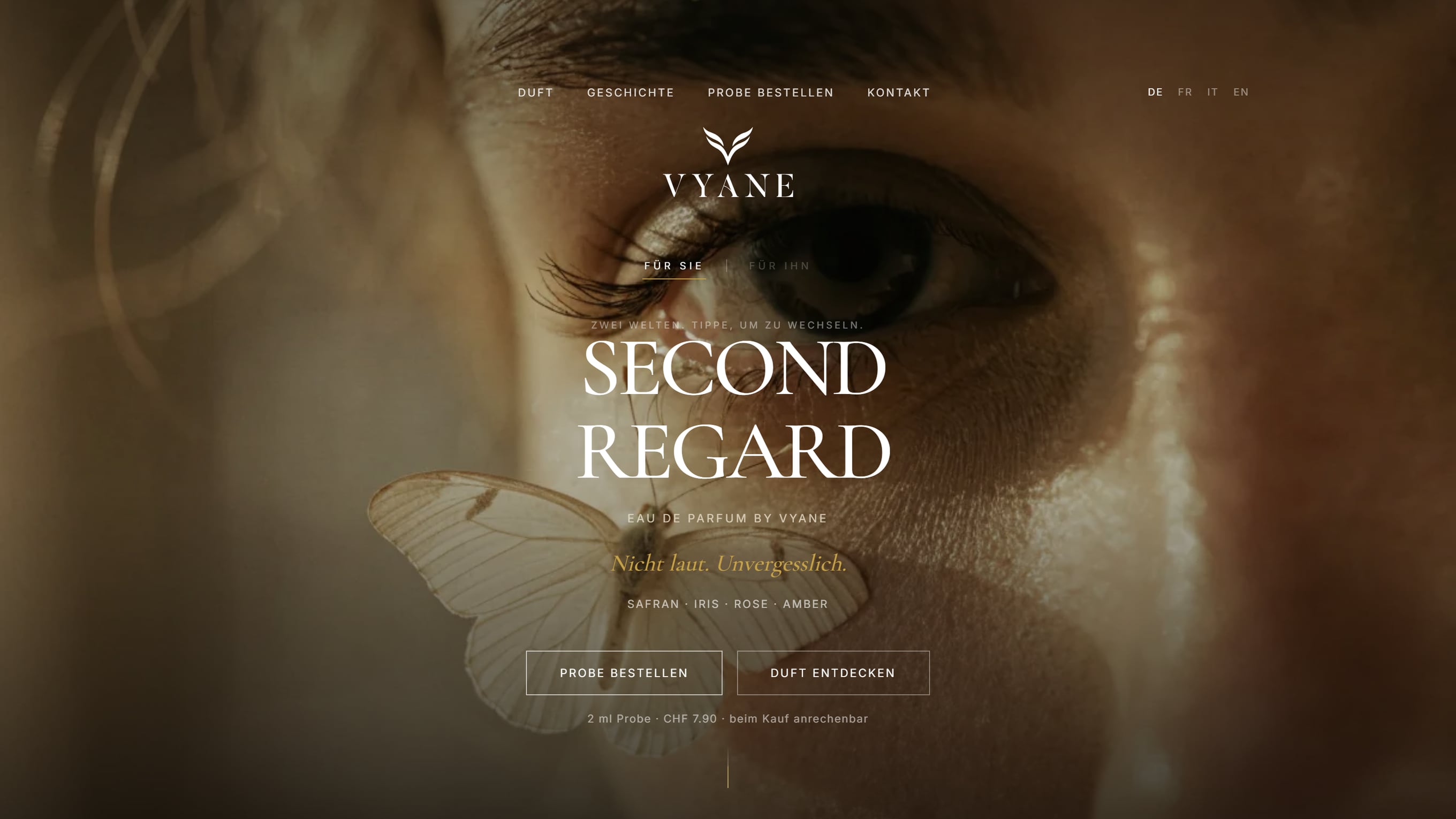
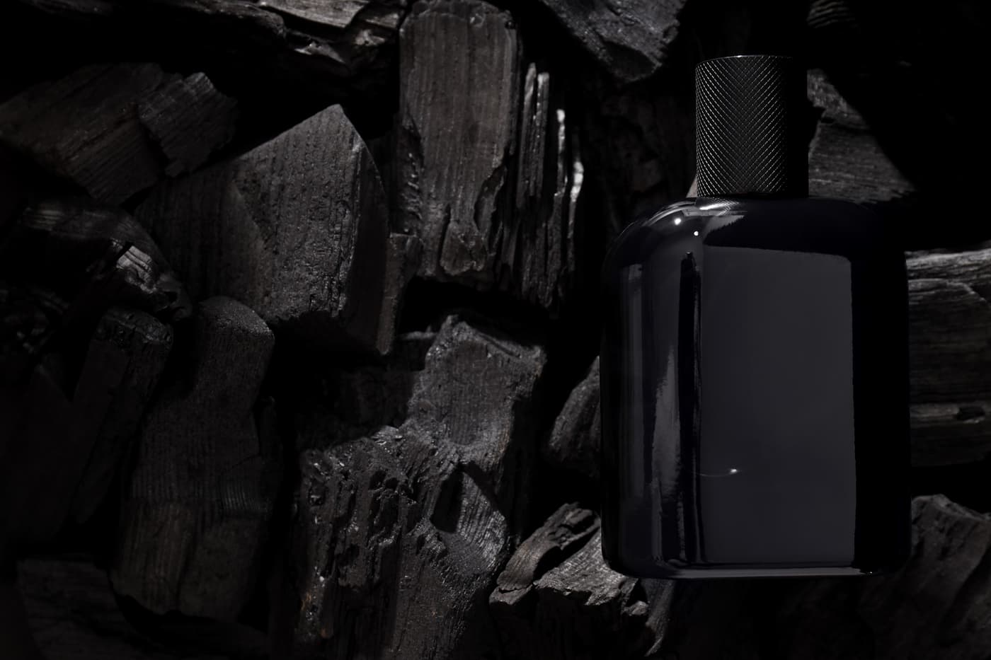
A niche perfume brand that already works as a complete world before the first physical product exists.
‘Second Regard’ describes the moment when something only reveals its effect at second glance. That led to a quiet, intimate brand idea: not seducing loudly, but staying in the memory.
Clear space. Around the logo there is a free space of a quarter of its height. No text, images or edges reach into this zone.
Minimum size. 24 px high on screen, 8 mm in print.
Not allowed. The logo is never distorted, rotated or set in other colours.
Heading · Georgia
ABCDEFGHIJKLMNOPQRSTUVWXYZ
abcdefghijklmnopqrstuvwxyz
0123456789 & ! ? «»
Second Regard.
Heading · 64 / 64
Niche perfume
Subheading · 29 / 35
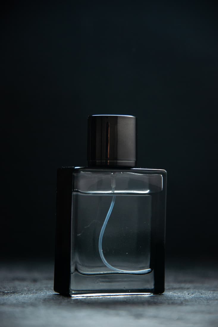
‘Second Regard’ describes the moment when something only reveals its effect at second glance. That led to a quiet, intimate brand idea: not seducing loudly, but staying in the memory.
Body · 16 / 24 · Manrope Regular

Second Regard.
‘Second Regard.’
The line sums up what Vyane stands for. It accompanies the logo on campaigns, packaging and online, but never within the logo’s own clear space.

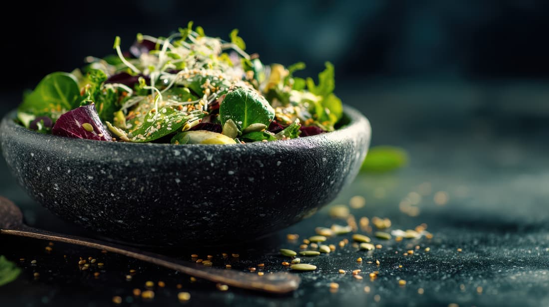
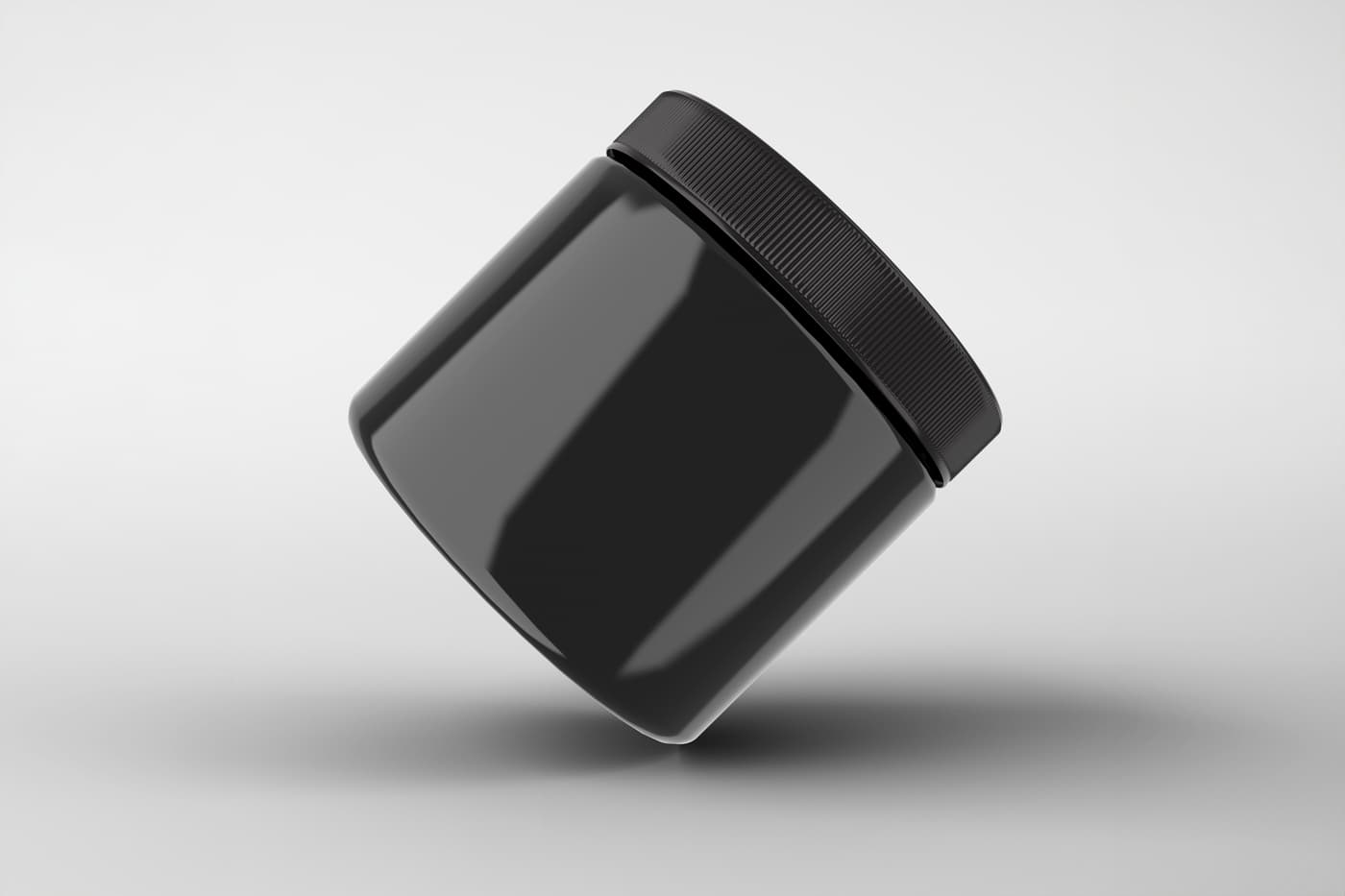
Nourissence sells supplements from organic farming. The brand needed to feel natural and still radiate expertise.
In the mark, the N becomes a leaf whose midrib forms the diagonal of the letter. The bold sans serif stays legible on small tins. The colours combine fresh green with warm oat.
Clear space. Around the logo there is a free space of a quarter of its height. No text, images or edges reach into this zone.
Minimum size. 24 px high on screen, 8 mm in print.
Not allowed. The logo is never distorted, rotated or set in other colours.
Heading · Manrope ExtraBold
ABCDEFGHIJKLMNOPQRSTUVWXYZ
abcdefghijklmnopqrstuvwxyz
0123456789 & ! ? «»
Food with roots.
Heading · 64 / 64
Organic nutrition
Subheading · 29 / 35
In the mark, the N becomes a leaf whose midrib forms the diagonal of the letter. The bold sans serif stays legible on small tins. The colours combine fresh green with warm oat.
Body · 16 / 24 · Manrope Regular

Food with roots.
‘Food with roots.’
The line sums up what Nourissence stands for. It accompanies the logo on campaigns, packaging and online, but never within the logo’s own clear space.
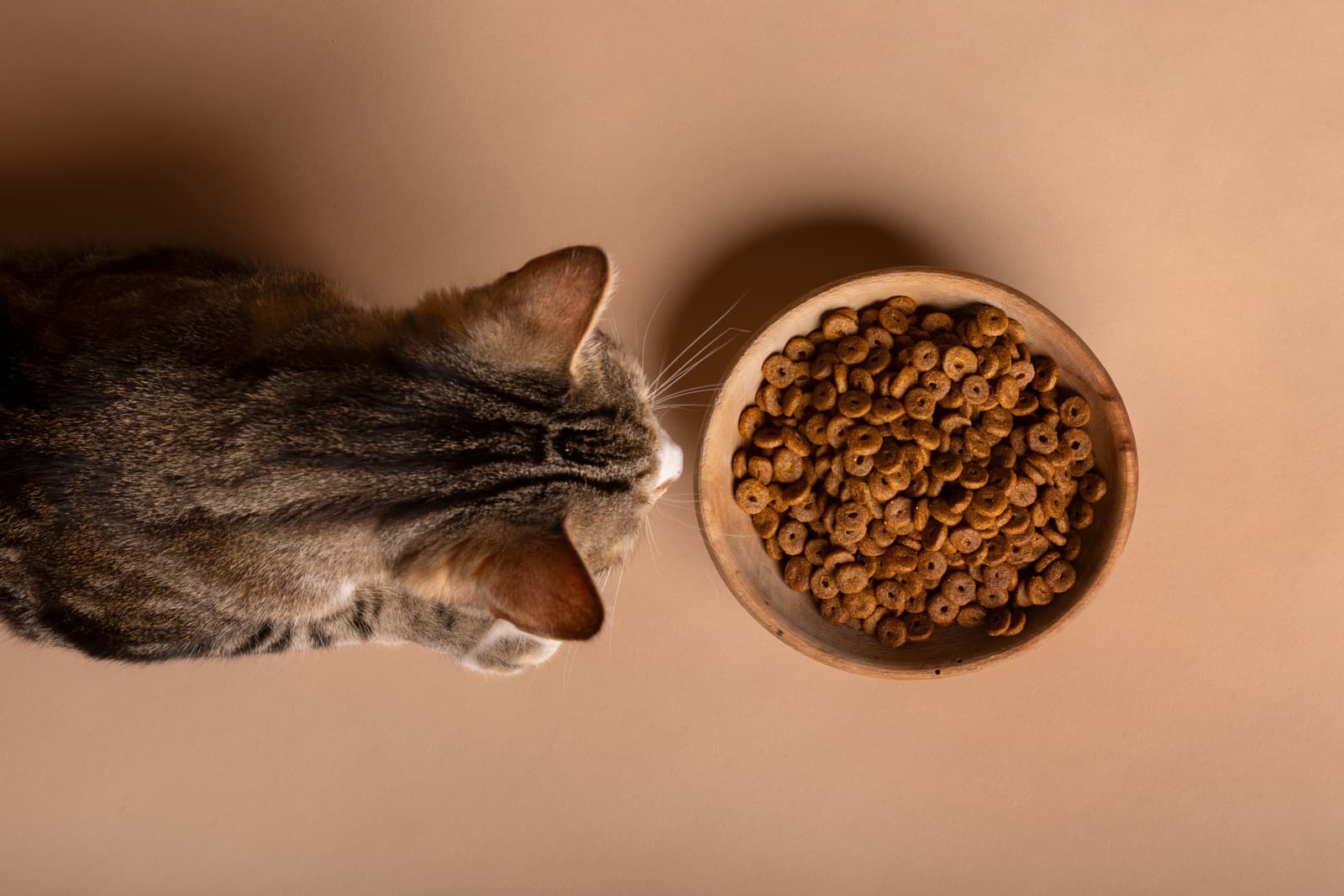
Planet Purrfect makes cat food from just a few ingredients. The brand needed to be playful and show quality.
A planet with cat ears and a ring: to the cat, she is the centre of the universe. The line drawing stays clear even on small tins. The rounded lettering and warm peach and cinnamon tones keep the brand light.
Clear space. Around the logo there is a free space of a quarter of its height. No text, images or edges reach into this zone.
Minimum size. 24 px high on screen, 8 mm in print.
Not allowed. The logo is never distorted, rotated or set in other colours.
Heading · Manrope Bold
ABCDEFGHIJKLMNOPQRSTUVWXYZ
abcdefghijklmnopqrstuvwxyz
0123456789 & ! ? «»
The world revolves around the cat.
Heading · 64 / 64
Cat food
Subheading · 29 / 35
A planet with cat ears and a ring: to the cat, she is the centre of the universe. The line drawing stays clear even on small tins. The rounded lettering and warm peach and cinnamon tones keep the brand light.
Body · 16 / 24 · Manrope Medium
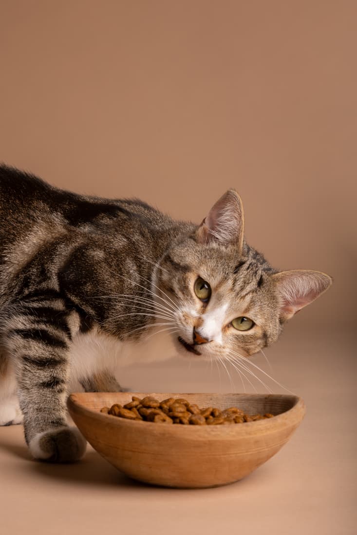
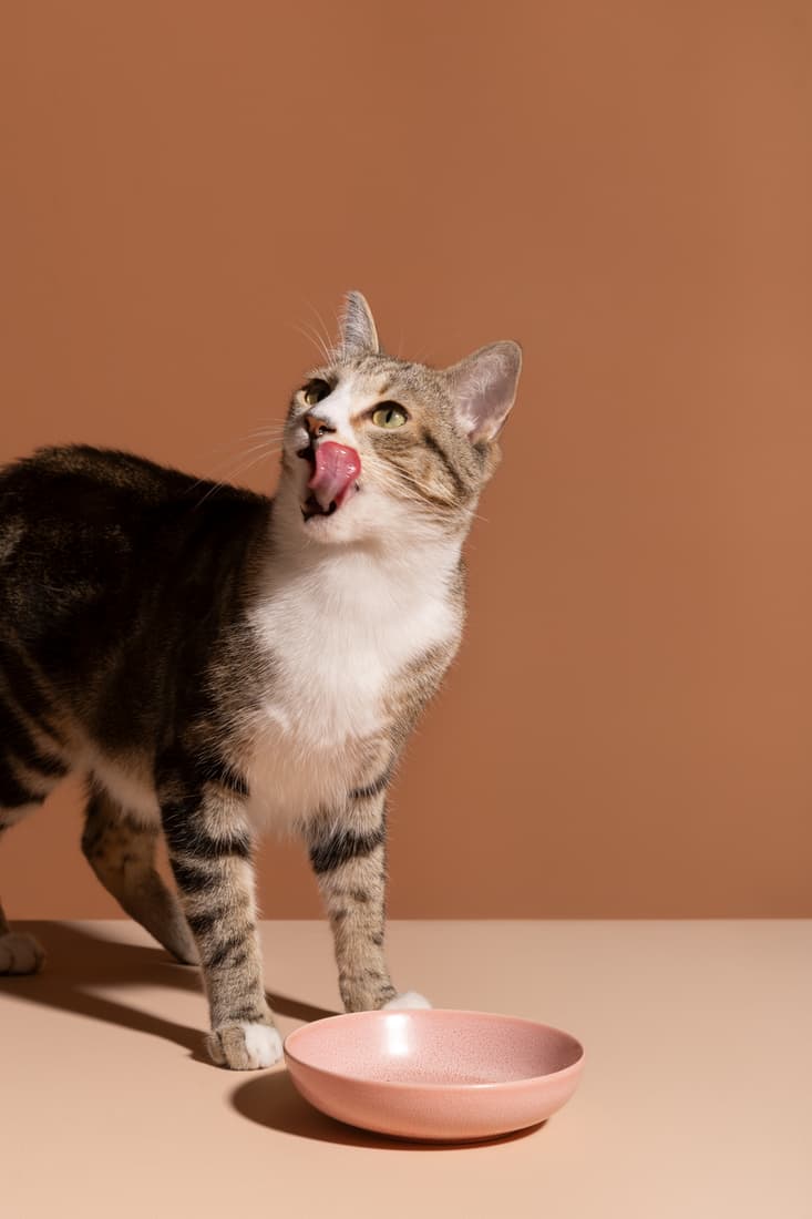
The world revolves around the cat.
‘The world revolves around the cat.’
The line sums up what Planet Purrfect stands for. It accompanies the logo on campaigns, packaging and online, but never within the logo’s own clear space.
Ducklayer sells notebooks, fountain pens and paper for people who still think by hand. The brand needed wit and to show craft.
A single line becomes a duck whose body is also a fountain pen. The letter-spaced sans serif looks like a stamp. The colours come from ink, paper and brass.
Clear space. Around the logo there is a free space of a quarter of its height. No text, images or edges reach into this zone.
Minimum size. 24 px high on screen, 8 mm in print.
Not allowed. The logo is never distorted, rotated or set in other colours.
Heading · Manrope SemiBold
ABCDEFGHIJKLMNOPQRSTUVWXYZ
abcdefghijklmnopqrstuvwxyz
0123456789 & ! ? «»
Write yourself free.
Heading · 64 / 64
Stationery
Subheading · 29 / 35
A single line becomes a duck whose body is also a fountain pen. The letter-spaced sans serif looks like a stamp. The colours come from ink, paper and brass.
Body · 16 / 24 · Manrope Regular



Write yourself free.
‘Write yourself free.’
The line sums up what Ducklayer stands for. It accompanies the logo on campaigns, packaging and online, but never within the logo’s own clear space.
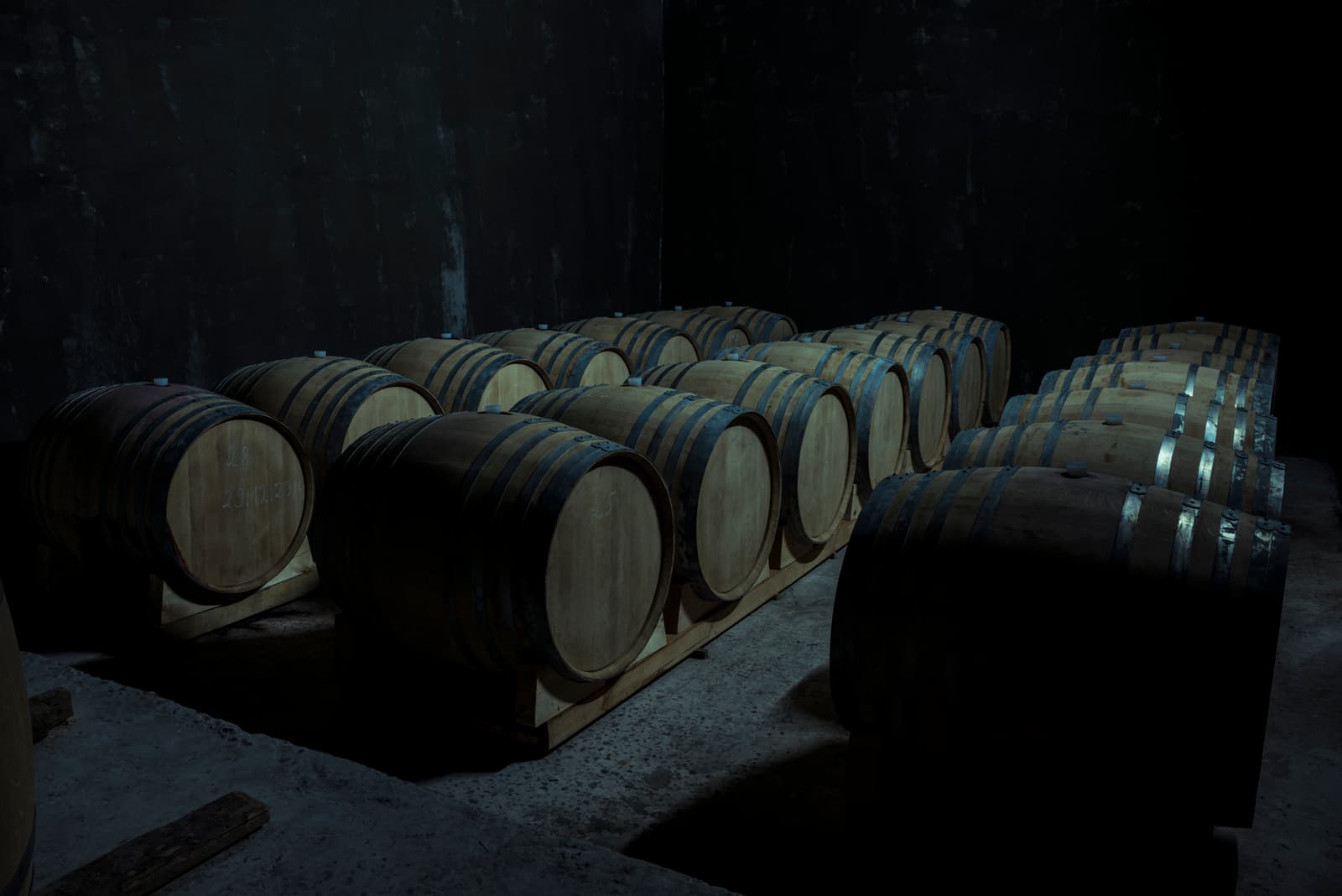
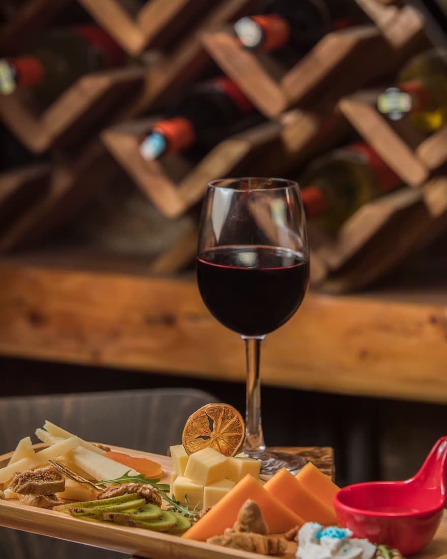
Kork & Horn is a wine bar with a kitchen drawing on forest and vineyard. The brand needed to feel warm and show a bit of a stubborn streak.
A stag’s head is cut out of the circle, and its antlers turn into a corkscrew. The open sans serif works on the menu, the bottle label and the sign. The colours come from red wine, oak and lime.
Clear space. Around the logo there is a free space of a quarter of its height. No text, images or edges reach into this zone.
Minimum size. 24 px high on screen, 8 mm in print.
Not allowed. The logo is never distorted, rotated or set in other colours.
Heading · Manrope Medium
ABCDEFGHIJKLMNOPQRSTUVWXYZ
abcdefghijklmnopqrstuvwxyz
0123456789 & ! ? «»
Poured wild.
Heading · 64 / 64
Wine bar
Subheading · 29 / 35
A stag’s head is cut out of the circle, and its antlers turn into a corkscrew. The open sans serif works on the menu, the bottle label and the sign. The colours come from red wine, oak and lime.
Body · 16 / 24 · Georgia
Poured wild.
‘Poured wild.’
The line sums up what Kork & Horn stands for. It accompanies the logo on campaigns, packaging and online, but never within the logo’s own clear space.

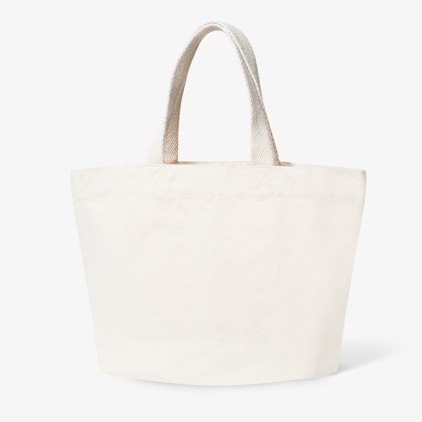
No Bad Cats. advises people whose cats scratch, spray or call out at night. The brand needed to feel confident and never assign blame.
A friendly cat face and a full stop at the end that says: that’s how it is. The soft, compact lettering feels approachable. The palette stays light and calming, with one warm accent.
Clear space. Around the logo there is a free space of a quarter of its height. No text, images or edges reach into this zone.
Minimum size. 24 px high on screen, 8 mm in print.
Not allowed. The logo is never distorted, rotated or set in other colours.
Heading · Manrope Bold
ABCDEFGHIJKLMNOPQRSTUVWXYZ
abcdefghijklmnopqrstuvwxyz
0123456789 & ! ? «»
There are no bad cats.
Heading · 64 / 64
Cat behaviour
Subheading · 29 / 35
A friendly cat face and a full stop at the end that says: that’s how it is. The soft, compact lettering feels approachable. The palette stays light and calming, with one warm accent.
Body · 16 / 24 · Manrope Regular


There are no bad cats.
‘There are no bad cats.’
The line sums up what No Bad Cats. stands for. It accompanies the logo on campaigns, packaging and online, but never within the logo’s own clear space.
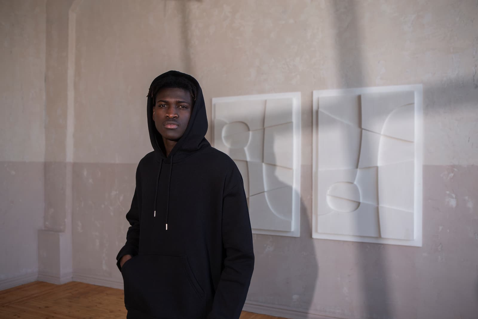
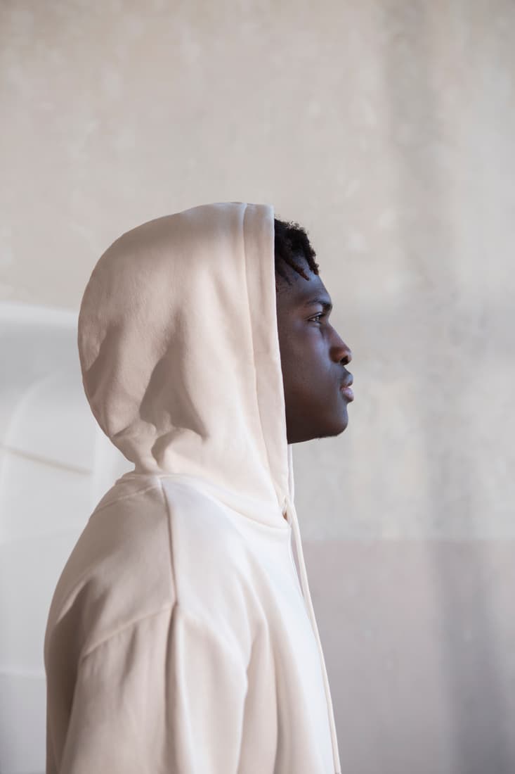
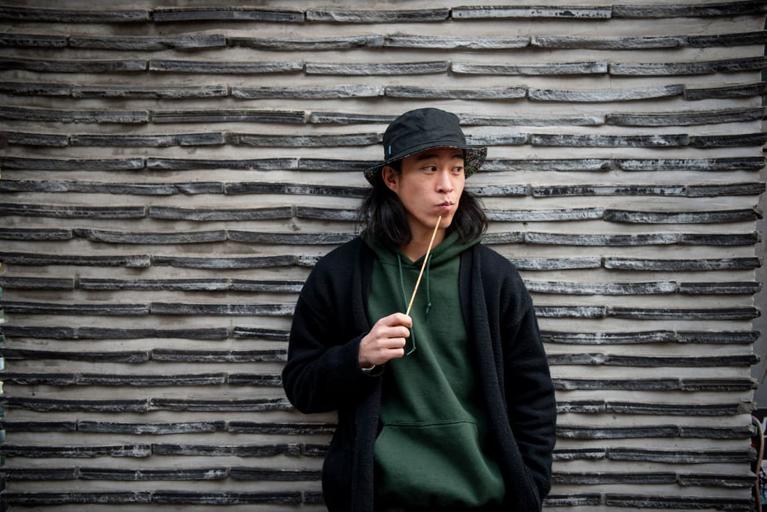
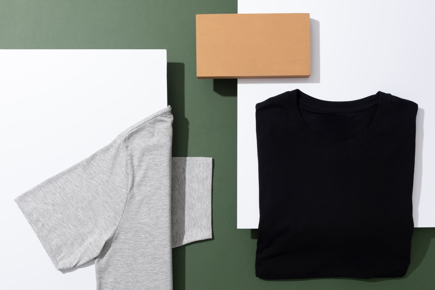
Stray is a streetwear label built on small runs and screen printing. The brand needed to be raw and work on fabric.
A wolf’s head carries the name across its face, drawn by hand rather than with a ruler. The mark holds up as a patch, a print and a sticker. The colours stick to black, concrete and suede.
Clear space. Around the logo there is a free space of a quarter of its height. No text, images or edges reach into this zone.
Minimum size. 24 px high on screen, 8 mm in print.
Not allowed. The logo is never distorted, rotated or set in other colours.
Heading · Manrope ExtraBold
ABCDEFGHIJKLMNOPQRSTUVWXYZ
abcdefghijklmnopqrstuvwxyz
0123456789 & ! ? «»
Untamed.
Heading · 64 / 64
Streetwear
Subheading · 29 / 35
A wolf’s head carries the name across its face, drawn by hand rather than with a ruler. The mark holds up as a patch, a print and a sticker. The colours stick to black, concrete and suede.
Body · 16 / 24 · Manrope Medium
Untamed.
‘Untamed.’
The line sums up what Stray stands for. It accompanies the logo on campaigns, packaging and online, but never within the logo’s own clear space.

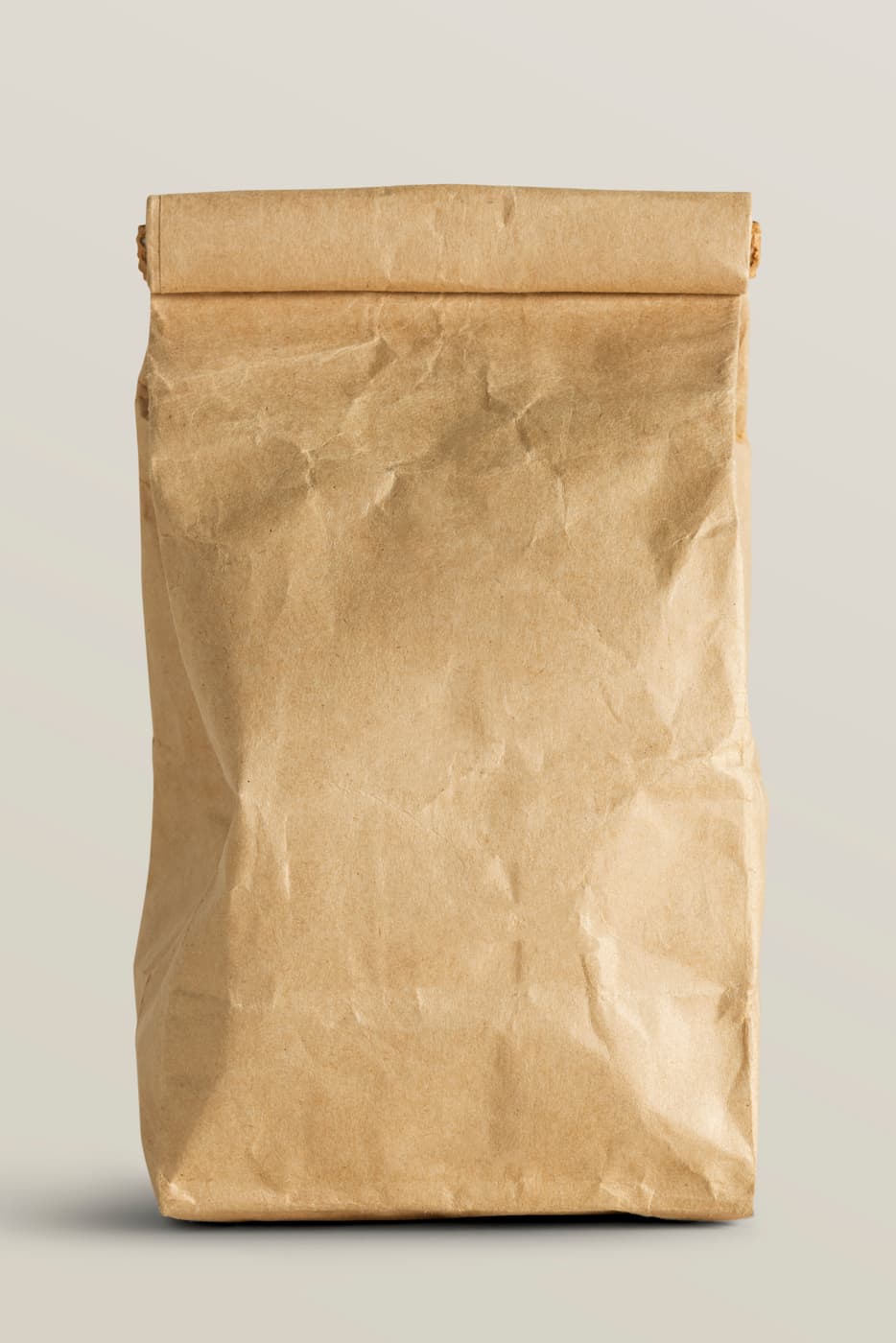
Luna Nord blends herbal teas from Nordic plants for the evening. The brand needed to feel calm and a little mysterious.
A half-closed eye in a round stamp, with the name running around it. The seal works on the tin, the bag and the cup. The palette runs from chamomile through honey to slate.
Clear space. Around the logo there is a free space of a quarter of its height. No text, images or edges reach into this zone.
Minimum size. 24 px high on screen, 8 mm in print.
Not allowed. The logo is never distorted, rotated or set in other colours.
Heading · Manrope Bold
ABCDEFGHIJKLMNOPQRSTUVWXYZ
abcdefghijklmnopqrstuvwxyz
0123456789 & ! ? «»
Tea for the long nights.
Heading · 64 / 64
Herbal tea
Subheading · 29 / 35
A half-closed eye in a round stamp, with the name running around it. The seal works on the tin, the bag and the cup. The palette runs from chamomile through honey to slate.
Body · 16 / 24 · Georgia


Tea for the long nights.
‘Tea for the long nights.’
The line sums up what Luna Nord stands for. It accompanies the logo on campaigns, packaging and online, but never within the logo’s own clear space.
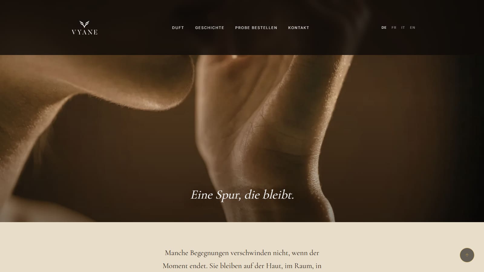
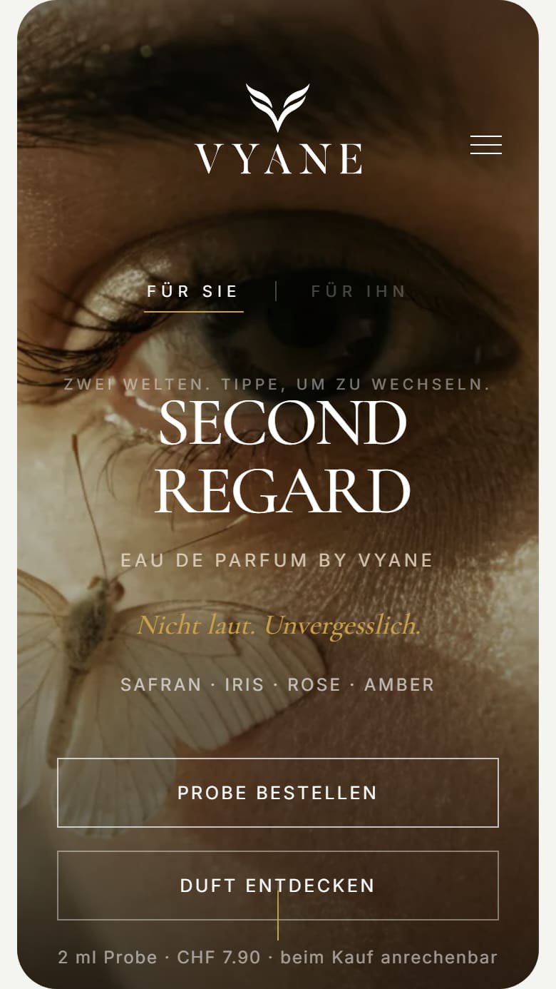
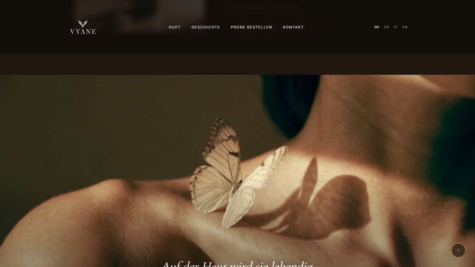
A fragrance brand with a name, a story and images before the first bottle exists.
You can’t show a scent. The brand still had to convey closeness and quality, even though the bottle and packaging only existed as an idea. And it shouldn’t look like just another luxury brand.
‘Second Regard’ is the moment when something only has its effect at second glance. That became a quiet, intimate brand: not loud, but one that stays with you.
I developed the name, identity, fragrance structure, product images and sales page together. That way images and website could come about while the product was still in the works.
Today Vyane has a finished brand with a story, a first fragrance and a landing page. The project shows that brand, images and website can come about at the same time.
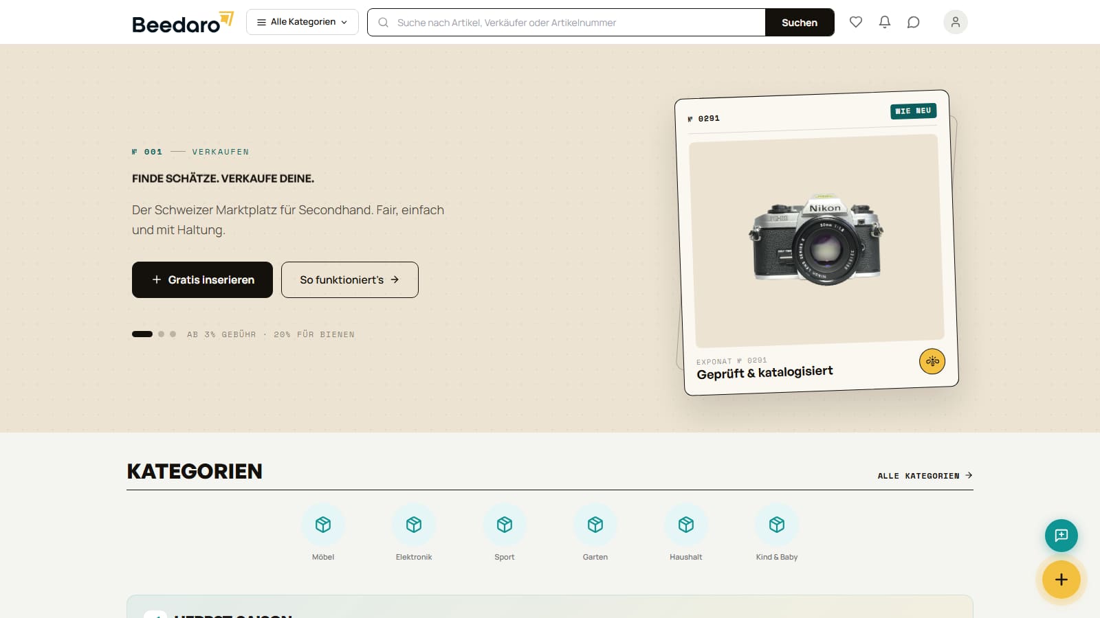
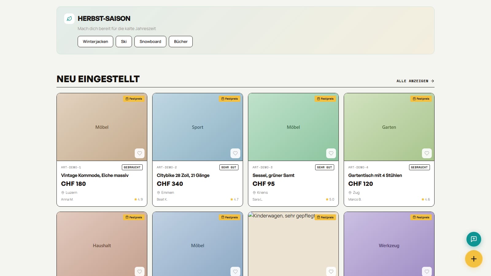
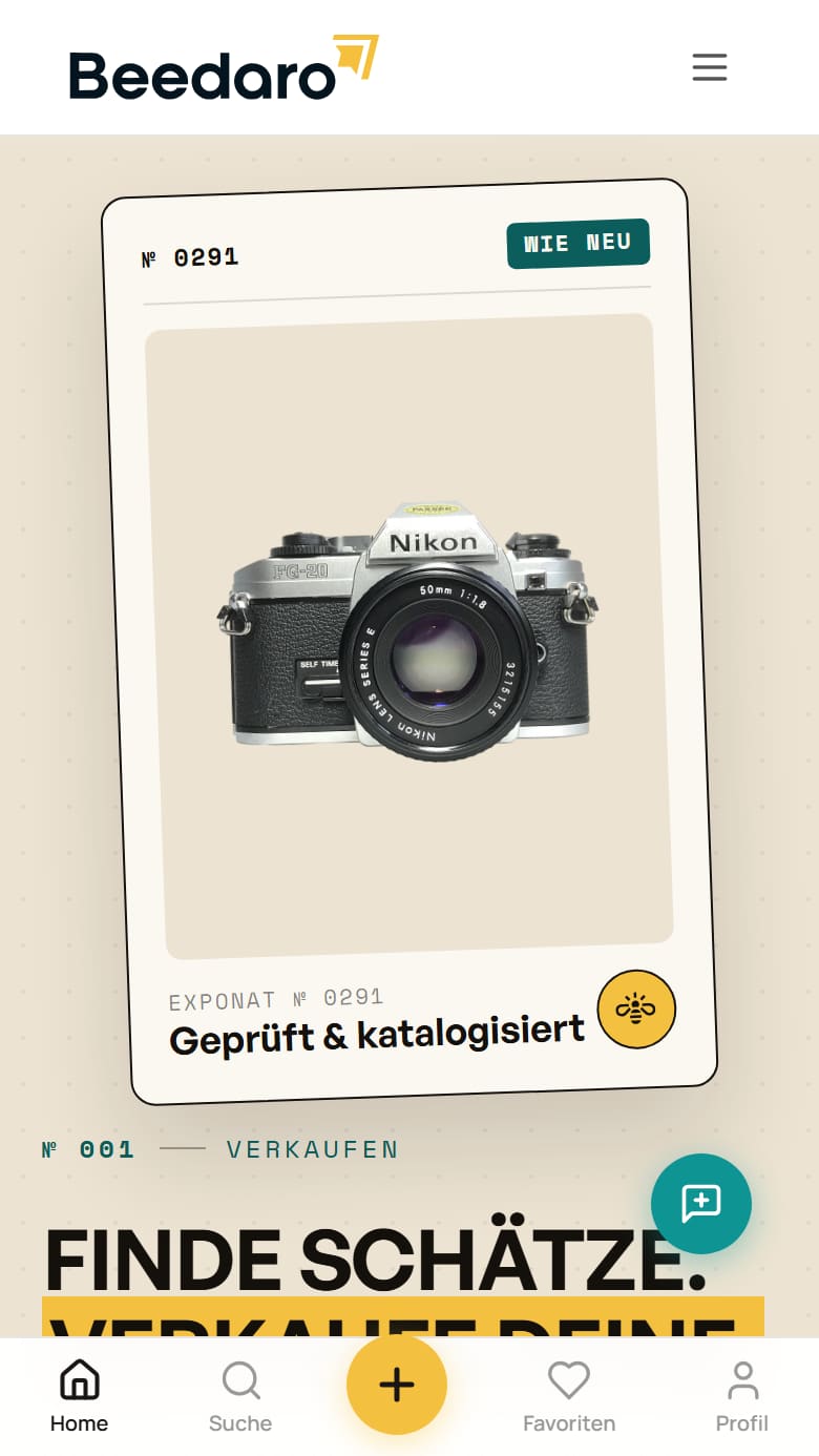
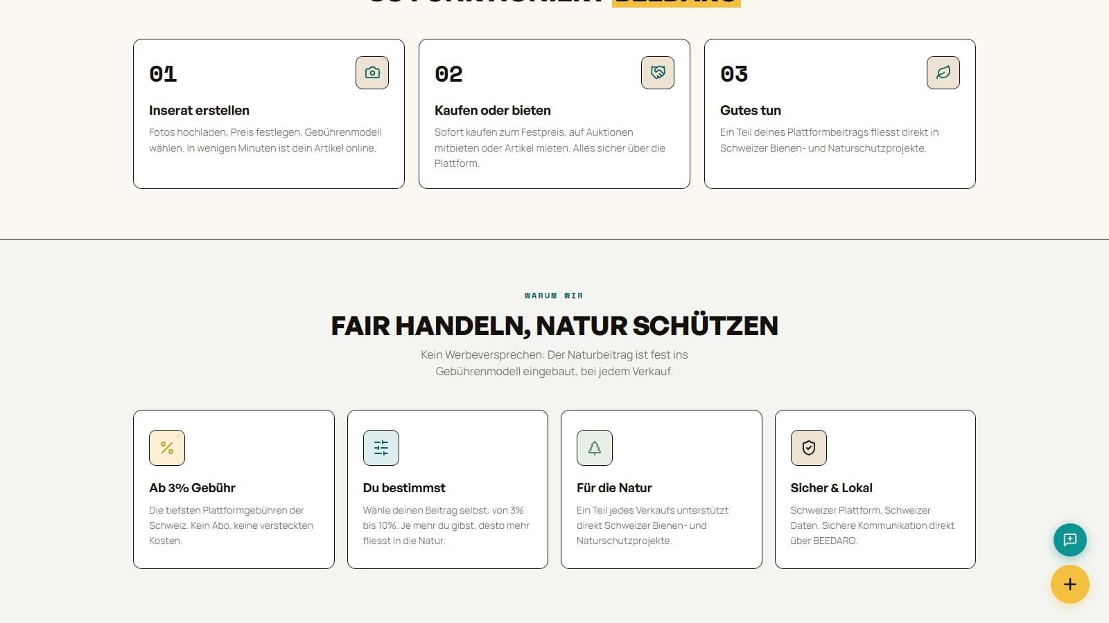
A Swiss marketplace where sellers decide for themselves what they give to the platform. Part of it goes to nature.
A new marketplace needs sellers, buyers and trust, all at the same time. A copy of the big platforms isn’t enough for that. Beedaro needed a reason for people to trade there and stay.
Sellers choose their own contribution to the platform, above a fair minimum. Part of it goes to bee and nature projects. That way fairness isn’t an advertising slogan, but part of every sale.
Listings, search, favourites, bids, profiles, reviews, chat and orders: all in one application. Choosing a contribution, paying and settling up runs as one clear flow.
The public marketplace is fully clickable in the preview. You can see how Beedaro works and what it does differently from the big players.
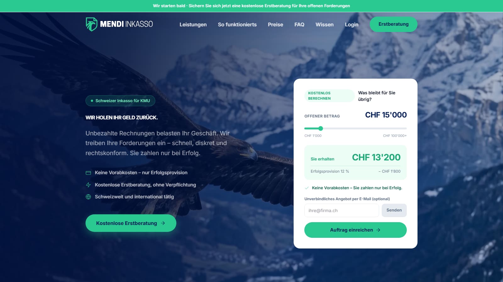
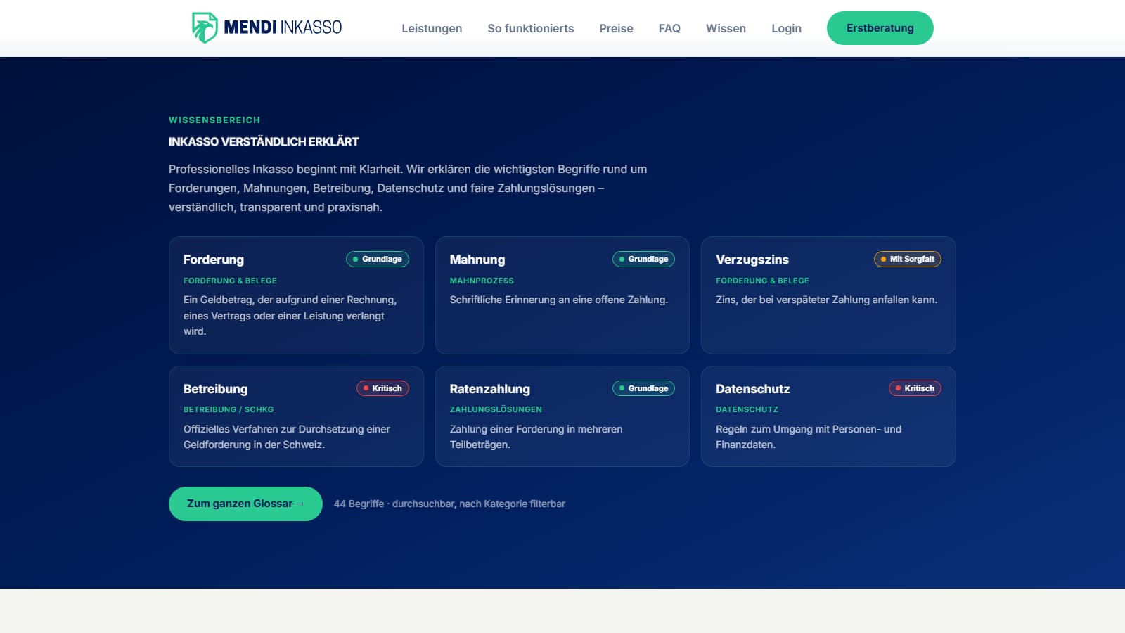
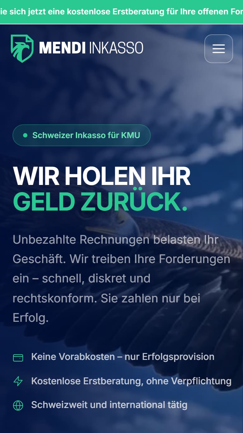
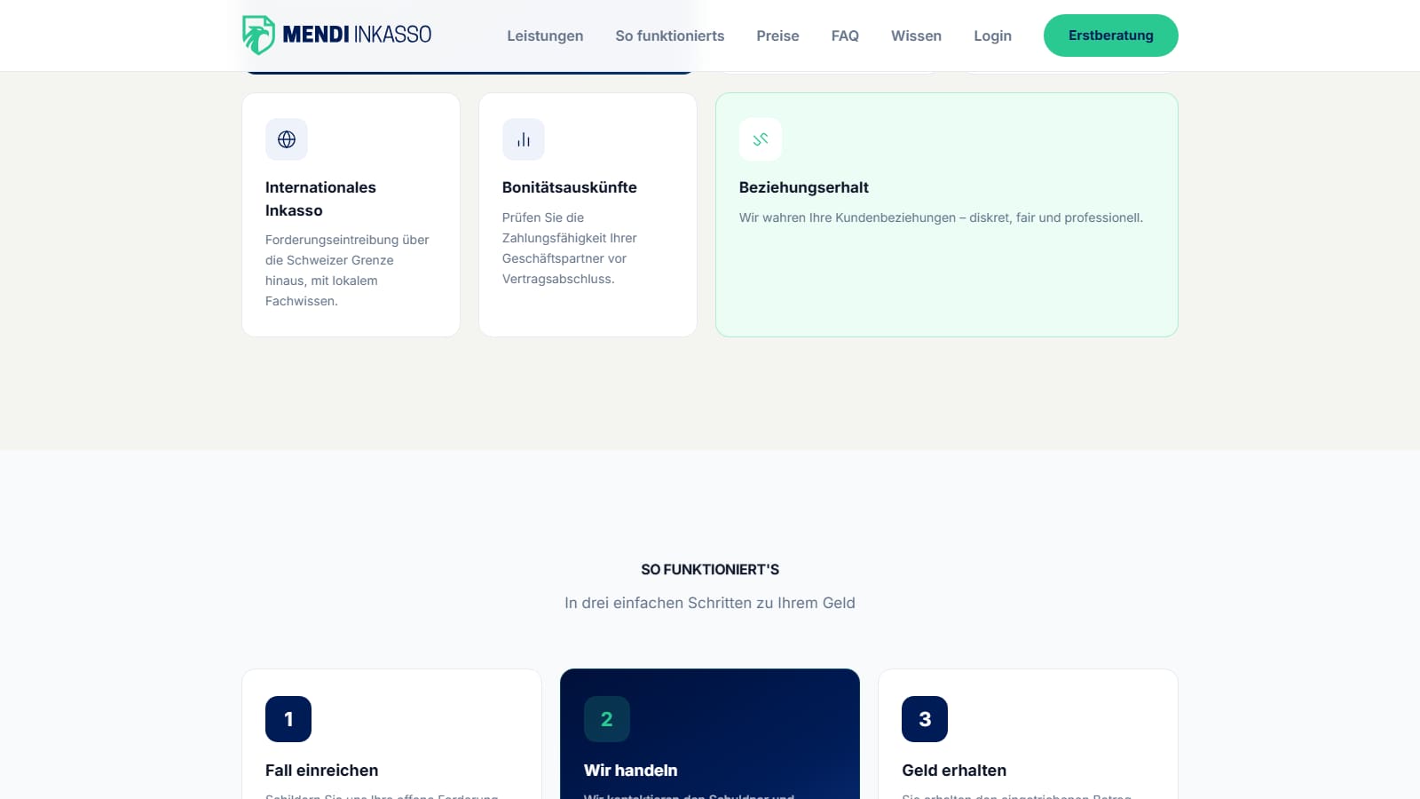
Debt collection for Swiss SMEs that stays matter-of-fact. No intimidation, but transparent for both sides.
Debt collection is unpleasant for everyone: for the one who wants the money and for the one who owes it. Many providers come across as opaque or aggressive. Mendi needed to build trust and still stay binding.
Every case is a clear path: amount outstanding, deadline, next step, possible settlement. Clarity instead of a black box, a calm tone instead of pressure.
I designed the whole flow of a case: an overview for clients, a separate portal for debtors, automatic QR-bills, instalment payments and payment tracking.
Mendi runs as a working prototype. It shows that a sensitive subject can be handled more simply and more humanely in digital form. Brand, flow and interface follow the same idea: clarity builds trust.
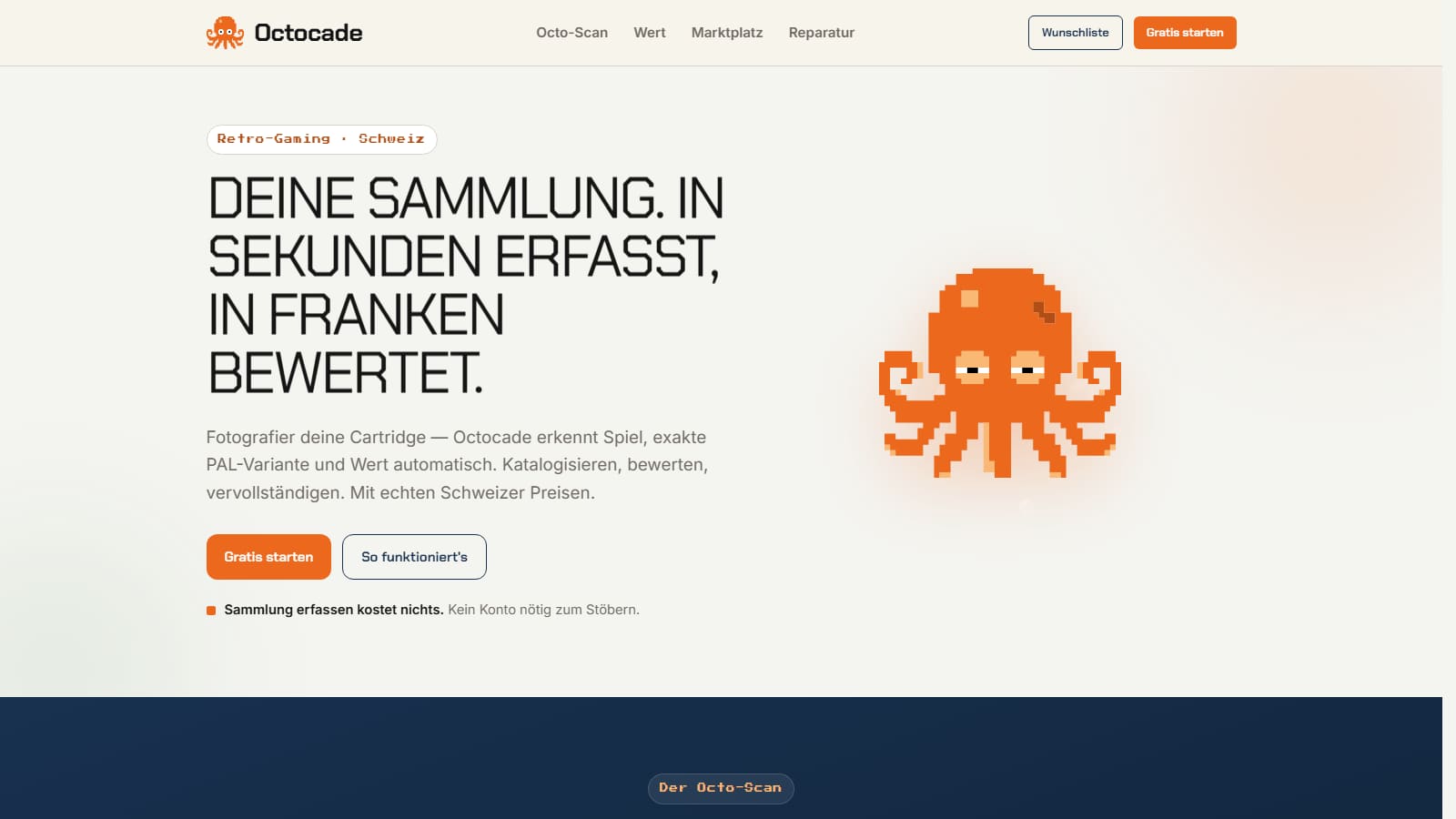
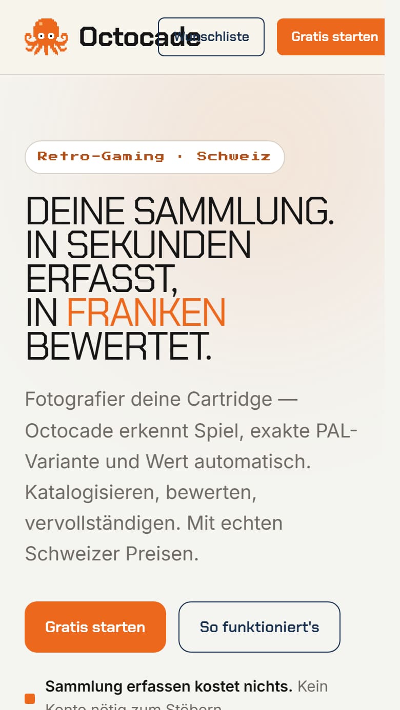
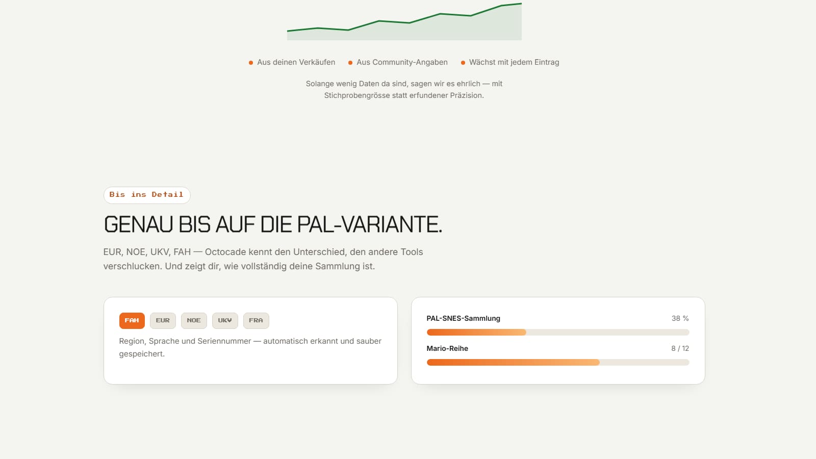
Collection and marketplace for retro games. One photo is enough, and the game is filed correctly.
Collectors don’t just tell games apart by title, but by region, edition, condition and variant. That’s exactly what makes cataloguing by hand slow and price comparisons unreliable.
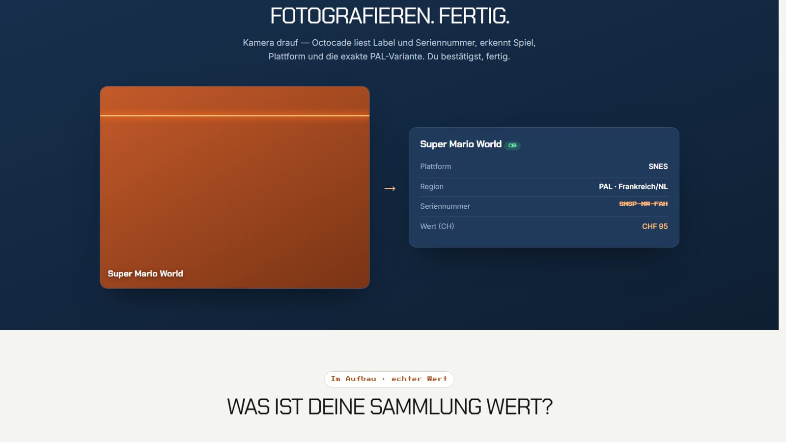
Photograph the cartridge, done. Octocade recognises the game and variant, fills in the collection and estimates the value. The most tedious part becomes the easiest.
Photo recognition, barcode scanner, game database, collection, valuation and marketplace all mesh together. A game lands in your collection first and can be sold straight from there.
The prototype combines the joy of collecting with technology that takes the work off your hands. Its own pixel mascot and the retro look give the whole thing character.
Information about the operator of this website and legal notes.
This translation is provided for convenience. The German version is legally binding.
MOQRO by Denis Mihaljevic
Gemeindehausstrasse 11B
6010 Kriens
Switzerland
UID (Swiss business ID): CHE-237.380.784
Legal form: sole proprietorship
Website: www.moqro.ch
Email: hello@moqro.ch
The content of this website has been created with care. However, no guarantee can be given for its accuracy, completeness or timeliness.
Some of the projects presented are in development or in the concept phase. The previews contain sample data; features, prices and schedules are non-binding and subject to change.
The content, texts, designs, brands and program code published on this website are subject to Swiss copyright law. Any further use requires the prior written consent of MOQRO.
The photographs in the logofolio projects come from the Freepik catalogue and are used under the Freepik licence. The logos and websites are works by MOQRO.
This website may contain links to external websites. The respective provider is responsible for their content; MOQRO has no influence over it.
This page was last updated: July 2026.
How MOQRO processes and protects personal data on this website.
This translation is provided for convenience. The German version is legally binding.
MOQRO by Denis Mihaljevic
Gemeindehausstrasse 11B
6010 Kriens, Switzerland
Email: hello@moqro.ch
Personal data is processed in accordance with the Swiss Federal Act on Data Protection (FADP).
When this website is accessed, technically necessary data may be processed, in particular IP address, time of access, page accessed and browser type. This information serves the secure and stable operation of the website.
If you contact us by email, we process your email address and the content of your message solely to handle and answer your enquiry. It is not passed on for any other purpose.
If you use the contact form, we process the details you enter (name, email address, message and, optionally, topic, budget, timeframe and link) for the same purpose. The enquiry is sent to MOQRO by email; your IP address is included to prevent abuse. So that no enquiry is lost if delivery fails, it is also stored on the web server in Switzerland and deleted there once it has been answered.
Application documents are used only for the respective selection process and deleted no later than six months after it has been completed, unless you have agreed to them being kept for longer.
MOQRO itself does not use any cookies for analytics, tracking or marketing purposes. Technically necessary cookies may be used by the hosting and access platform.
The browser’s session storage only records that the loading animation has already been shown. This entry contains no personal data and disappears when the window is closed.
The main site serves the typeface it uses, Manrope, locally from its own web server. Loading the main site therefore does not create a connection to Google Fonts.
The live previews of Vyane, Beedaro, Mendi and Octocade contain sample data only. When they load, connections may be made to external services used in the respective projects.
These include in particular Google Fonts and Fontshare for typefaces. In the process, the IP address may be transmitted to the respective provider.
Under the FADP you have the right to information about the data processed about you, as well as to its correction or deletion. To do so, contact hello@moqro.ch.
We take appropriate technical and organisational measures to protect the data processed. The website is transmitted encrypted via HTTPS.
This privacy policy may be adapted to technical or legal changes. The current version applies. Last updated: July 2026.
This website carries out its own count of page views, hosted on the Swiss server. No cookies are set and no data is transmitted to third parties.
Only the following is recorded: page accessed, time, referring domain, device category and anonymous events such as sections reached or form steps completed. IP addresses are not stored.
To distinguish individual visits, an identifier is created based on a daily key. This key is generated anew every day and the previous one deleted; after that, recognition across several days is impossible, even for the operator. The data is deleted after 400 days.
Consent is not required for this processing, as no personal data is processed and no information from end devices beyond this is read.
Terms for design, consulting and development. Valid for all orders from July 2026.
This translation is provided for convenience. The German version is legally binding.
These General Terms and Conditions apply to all contracts between MOQRO by Denis Mihaljevic, Gemeindehausstrasse 11B, 6010 Kriens (hereinafter MOQRO) and the client (hereinafter the Client) for design, consulting, development and related services.
Deviating terms of the Client apply only insofar as MOQRO has agreed to them in writing. Side agreements must be in writing to be valid; email is sufficient.
Information on the website, in particular starting prices, is a non-binding guide. A contract is concluded when MOQRO submits a quote and the Client accepts it in writing or by email.
The accepted quote is decisive for the scope of services. These terms apply in addition; in the event of contradictions, the quote takes precedence.
MOQRO provides the services described in the quote at its professional discretion and with the care of a conscientious specialist business. Within the scope of the agreed order, design decisions rest with MOQRO.
Unless otherwise agreed, an order includes two rounds of revisions. It includes the conception, design and implementation of the agreed scope, but not ongoing operation, maintenance or further development after handover.
MOQRO may engage third parties for partial services. Responsibility towards the Client remains with MOQRO.
The Client provides all content, access, documents and decisions required to carry out the order in good time and in a usable form, and names a contact person authorised to make decisions.
The Client warrants that the content it supplies is free of third-party rights or that the necessary rights have been obtained. It indemnifies MOQRO against third-party claims arising from this content.
Delays within the Client’s sphere postpone agreed deadlines accordingly and may result in additional effort.
Deadlines are binding if they are expressly designated as such in the quote. Otherwise they are guidelines.
If delays occur, MOQRO informs the Client without delay and names a new deadline. Circumstances beyond MOQRO’s control, in particular failures of third-party service providers, do not give rise to consequences of default.
All prices are in Swiss francs and exclusive of value added tax. The amounts stated on the website are starting prices; the amount of the accepted quote is binding.
Unless otherwise agreed, invoicing is in three instalments: one third when the order is placed, one third after design approval, one third on handover. For orders under CHF 4’000, invoicing is in two instalments.
The payment term is 20 days from the invoice date. After it expires, the Client is in default without a reminder; default interest of 5% applies in accordance with Art. 104 of the Swiss Code of Obligations (CO). MOQRO may suspend ongoing work until payment is received.
If the Client requests changes that go beyond the agreed scope or the included rounds of revisions, the additional effort is estimated in advance and, after approval, charged at the agreed hourly rate.
If work steps that have already been approved subsequently turn out to need revision, this also counts as additional effort.
All rights to the work results remain with MOQRO until all claims have been paid in full.
Upon full payment, MOQRO grants the Client the non-exclusive right, unlimited in space and time, to use the work results for the contractually agreed purpose. Any further use, in particular passing them on to third parties or using them for other brands, requires a separate agreement.
Drafts and variants that are not implemented remain with MOQRO. The moral rights of the author under the Swiss Copyright Act remain with MOQRO in any case.
Source files are handed over on request, provided this has been agreed.
Licences for typefaces, images and software libraries, as well as costs for hosting, domains and third-party services, are not included in the price unless the quote provides otherwise.
Wherever possible, such services are licensed directly to the Client, so that the rights and control lie with the Client. Third-party services are subject to their own terms.
After handover, the Client inspects the work and reports defects in writing within ten working days. If no report is made, the work is deemed accepted.
MOQRO remedies reported defects free of charge within a reasonable period. Differences of opinion on design do not constitute a defect.
For software: there is no entitlement to freedom from errors under all conceivable conditions. The agreed functionality in the agreed environments is decisive.
MOQRO is liable for damage caused intentionally or through gross negligence. Liability for slight negligence is excluded to the extent permitted by law.
There is no liability for indirect and consequential damage, in particular loss of profit, data loss or third-party claims, nor for failures of third-party services.
Liability is limited in amount to the fee paid for the order concerned, insofar as this is permitted by law.
Both parties treat confidential information of the other party as confidential and use it only for processing the order. This obligation continues beyond the end of the contract.
The processing of personal data is governed by the Swiss Federal Act on Data Protection and by the privacy policy of this website.
MOQRO may show the services provided as a reference, naming the Client, in particular on its own website and on social media, as soon as the project is public.
The Client may object to this in writing at any time.
Contracts for defined works end with acceptance. Ongoing support arrangements may be terminated by either party with one month’s notice to the end of a month.
In the event of early termination by the Client, the services provided up to that point are charged according to effort, but at least the instalments already due.
The contractual relationship is governed exclusively by Swiss law, excluding the United Nations Convention on Contracts for the International Sale of Goods.
The exclusive place of jurisdiction is Lucerne, Switzerland. Mandatory statutory places of jurisdiction are reserved.
Should any provision of these terms be invalid, the validity of the remaining provisions remains unaffected.
These terms apply from July 2026. MOQRO may amend them at any time; the version valid at the time the contract is concluded is decisive.